The Farmer Who Tried to Time the Market
On a 150 year old chart, why it fooled me for a minute, and what the numbers actually say. September 2026.
A wavy line keeps floating around my feed. Somebody drew it in 1875, an Ohio farmer of all people, and the caption is always the same: this chart called every crash, all the way to the ones we just lived through. It looked way too clean to be real, so instead of nodding along like usual I decided to actually check it.
His name was Samuel Benner. He raised hogs and worked iron in Ohio, and the Panic of 1873 flattened him financially. A lot of people would have walked away from markets forever after that. He did the opposite. He sat down with decades of old price records for iron, corn and hogs, and he went looking for the beat behind the busts.
What he thought he found was a rhythm. The big panics seemed to arrive in a repeating pattern of 18 years, then 20, then 16, and then back to 18 again. He nailed that beat onto the crashes he already knew about, 1819, 1837, 1857, 1873, and simply walked it forward on the page all the way out to the year 2059. Then he layered a slower up and down wave on top for the fat years and the lean years, and because he was a man of the 1870s he tied a bit of it to sunspots and crop weather. That is the entire machine. Once you know those three numbers you can redraw his whole famous chart with a pencil and a ruler.
Here is the actual thing he published, the card he told people to save and watch closely.

Benner’s original card, “Periods When to Make Money.” The letters mark his three phases. A is a panic year, B is good times when you sell, C is hard times when you buy. Public domain, via Wikimedia Commons.
It is a beautiful object, but the old lettering is hard to read, so I redrew his rhythm clean across the last century. The red lines are the years he tagged as panics.
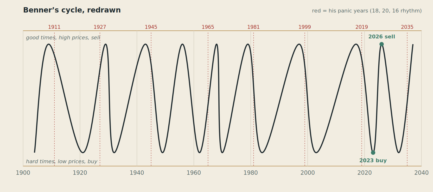
The same cycle in my own clean version. The wave is the good times to hard times swing, the dashed red lines are his panic years marching in that 18, 20, 16 beat, and the green dots are the two turning points people quote at me the most right now.
Why it feels like magic
Line it up against real history and the first stretch is perfect. His 1837, his 1857, his 1873 all land exactly on true panics. That part impressed me until I remembered something obvious. Those were the crashes he built the cycle out of in the first place. Matching them is not a prediction, it is just showing me the ruler he used to draw the lines. Any rule you tune on that data will hit those dates.
The rest of the trick is quieter. His chart is crowded with marks, panic years, sell years, buy years, so there is almost always a label sitting near whatever just happened. Give it a year or two of wiggle room and read it after the fact, and it will seem to catch everything. And the hits people love to quote, 2000 and 2008 and 2020, get pulled out of a record that also loudly flagged 1911 and 1927 and 1965, years when nothing special happened. Nobody screenshots the misses.
So I stopped guessing and tested it
I pulled the real S&P 500 returns going back to 1928 and asked the blunt question. If you stood on one of Benner’s panic years, did the market actually treat you badly? It did not. The average year across that whole span returned about 11.8 percent. The year right after each of his panic years came in near 9.2 percent, basically ordinary. The panic years themselves were actually good years to be invested. His timing, the thing everyone praises, had no edge I could find.
Then I tried his other claim, the good times versus hard times split. Using his own cycle to sort the years, the result came out backwards. The years he would call hard times averaged about 15.5 percent, better than the years he would call good times at about 9.3 percent. The famous studies that make him look brilliant get their answer by hand labeling the phases straight off his drawing rather than off his arithmetic. When the labeling flips the result, that is not a signal, that is just someone choosing where to draw the buckets.
Cycles turned out to be real as a rhythm and fake as a calendar. The busts do come back. They just refuse to keep an appointment.
What a modern version would try instead
Here is the part I actually got excited about. Benner was not crazy, he was early. Economies really do breathe in and out, credit stretches and snaps, investment overshoots and corrects, moods run hot and then panic. His mistake was freezing that breathing into fixed calendar math forever. Real cycles wander. They stretch and shrink by huge amounts and they never punch a clock.
So a modern take drops the fixed dates and instead lays several independent cycles on top of each other, just to see where their clocks happen to line up. Not to name a day, only to spot the windows where a few different pressures arrive together. When I did that, two soft zones showed up, one around the end of this decade and one in the mid 2030s.
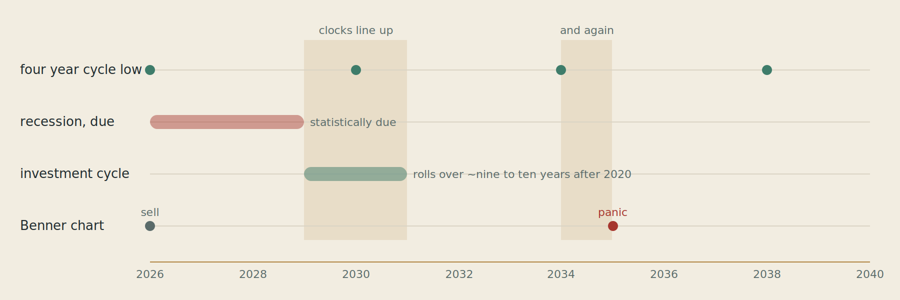
Four independent rhythms stacked on one timeline. Where the shaded columns fall is where the business cycle, the investment cycle, the four year cycle and Benner’s own chart drift into the same neighborhood. This is a map of pressure, not a date for anything.
I want to be honest about how weak even this is. The moment enough people believe in a 2030 top they act early and the pattern moves, a feedback loop Benner’s hog prices never had. The lengths genuinely wander, the last expansion ran eleven years and broke every rule about being due. And the biggest breaks usually come from outside the machine entirely. The 2020 crash was not the cycle maturing, it was a virus. No overlay contains that.
The one thing that genuinely works
After throwing out the timing games, one honest signal was left standing, and it is almost boring. It is price. Not the price today versus yesterday, but how expensive the whole market is relative to a decade of its own earnings, a number called the Shiller CAPE. The rule is simple. Pay a high price and the next ten years tend to be weak. Pay a low price and the next ten years tend to be strong.
I computed it from scratch on every single month since 1881. Each dot below is one starting month: how pricey the market was on the day you bought, against the real return per year you then earned over the following decade.
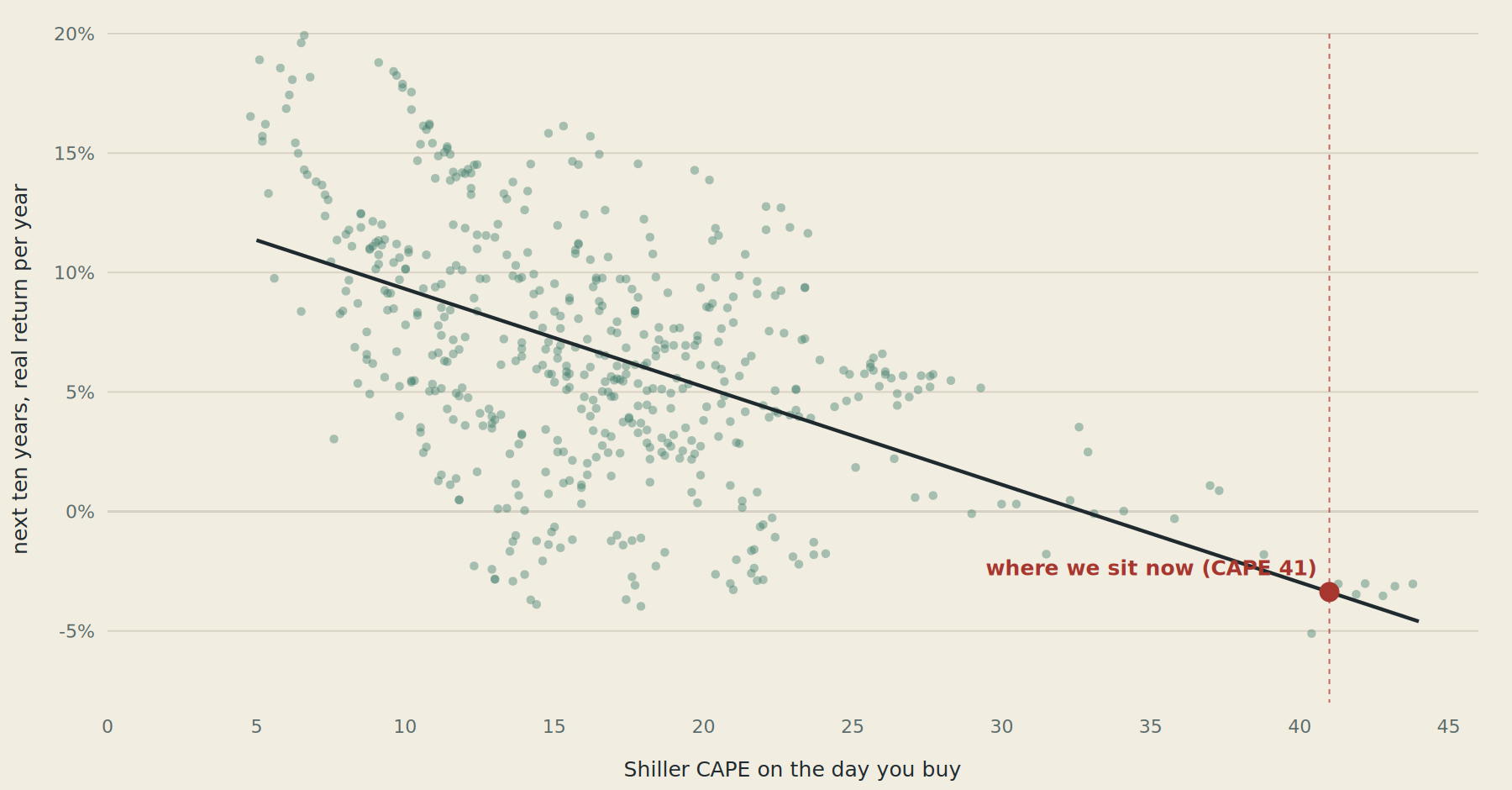
Every month since 1881. Buy cheap, on the left, and the next ten years paid well. Buy expensive, on the right, and they mostly did not. The dark line is the historical trend. The red dot is roughly where we stand today.
The direction is rock solid. Sort every month into ten price buckets and the cheapest tenth went on to pay about 11.9 percent a year after inflation, while the most expensive tenth paid about 2.4 percent. Every step up in price shaved the reward. It is not a guarantee, the cloud is fat, plenty of dots break the pattern. Price loads the dice, it does not roll them.
And where are we now. Off on the far right, at a reading of about 41, a level only ever seen once before, at the peak of the tech bubble in 1999 and 2000. The trend from there points to something close to flat, maybe slightly negative, in real terms over the next ten years. A lost decade for buying power, not a crash on a calendar, just a low base rate for whoever is buying at these prices. One small mercy is that against today’s bond yields stocks are not quite as stretched as they were in 2000.
What I actually believe now
I came in half hoping the farmer had cracked a secret code. He had not. What he had was a real intuition wearing a costume that promised too much. The busts really do return, so the rhythm is true. The exact years are a magic show, so the calendar is false. Anyone selling you a specific date, whether it is a dead farmer or a live hedge fund, is selling confidence they do not own.
The grown up version of his idea is quieter and less fun to screenshot. It says nothing about which Tuesday the market turns. It only says that starting from prices this high, the smart move is to expect less from the next ten years and to spread my bets, and then to stop pretending I know the date.
One honest note to close. I am a curious person who likes to check things, not a financial advisor, and none of this is advice. The whole point of the story is that even the best signal here is a base rate and a poor basis for timing anything. Take it as a tale about a farmer and a chart, which is all I meant it to be.